Project Update: Recent Design Projects at the Law School
While my day job as Manager of Electronic Communications at the University of Chicago Law School tends to lean more toward the tech and information architecture sides of web-work than the design side, I do occasionally get to undertake projects that use as much of the right side of my brain as they do the left (while our upcoming site-wide redesign promises to explode both sides).
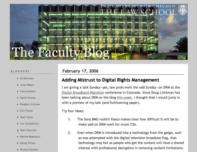
Since starting the job in August of last year, I’ve had the opportunity to do a couple of these projects. The highest profile one so far was a redesign of our Faculty Blog, which had been launched in 2005 using a slightly modified version of one of Typepad’s standard issue templates:
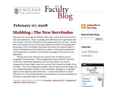
When I redesigned it this past fall, my primary goal was to make it more usable — get rid of the gray text on a gray background, add a prominent search box and make it easier for visitors to subscribe to the blog and get to the Law School website. I also separated out the podcast feed and added a widget in the sidebar so people could listen to the podcasts without leaving the blog page.
I was very pleased to see a presenter at the CASE V conference in December hold up the redesigned blog as an example of higher ed institutions “using social media well.”
I also used this design as inspiration for a Flash e-card that the Law School’s Annual Fund asked me to create. Considering it was my first attempt at Flash, I think the card came out pretty well. This was an especially fun project because I had the chance to create the music for the card as well. The music for these things is usually classical music calculated to be almost unnoticeable. I used a collage of samples from Apple’s Garageband program to create a piece that sounds to me a bit like it could have come from “Six Feet Under;” I even had someone ask me where they could purchase a copy.