Design Help Needed: Digital Signage
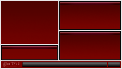
Anyone care to lend a poor blocked designer a hand? Last week it was brought to my attention that one of the Law School’s digital signs is a plasma screen (which, unlike the LCDs that display the signage throughout the rest of the building, carries a risk of burn-in from static images like the background image below (designed by Four Winds Interactive, the company that created the content management software we’re using for the signs).

Right now, the top left hand box features live TV, while the other boxes feature text that rotates periodically. The bottom bar contains a left-ward scrolling list of recent additions to our blogs, podcasts, etc. I need to figure out a way to keep the same color from being in the same place for longer than an hour. I’ve tried moving the various boxes around, but they’re all the same basic color. Changing the colors periodically might work, but will be ugly and inconsistent with our brand. Perhaps periodic “commercial” interruptions, where we expand some of our rotating content? Any suggestions would be much appreciated!
Have you checked to see if your screen has a “pixel shifting” option? This could eliminate your need to completely redesign your template.
Otherwise maybe just donate the screen to a nearby undergrad dorm and get yourself a LCD.
I don’t know if it does, but from what I’ve read, I don’t think the shifting would be enough to really make a difference — sounds like we’d wind up with two ghosts instead of one.
what if each panel rotated with the other panels, like tires on a car, and the bar at the bottom could move to the top. just a thought.
Pixel shifting is designed to prevent the screen from image burn. The picture moves around every so often to different pixel location.
This comment has been removed by a blog administrator.