Project Update: On the Table
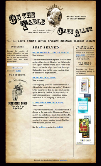
My stepfather, Gary Allen, is a professional food writer/editor/eater (ok, he doesn’t technically get paid to eat, but he takes it at least as seriously as any paying gig). Last year, as a birthday gift, I offered to redesign his website. His original site (which he had built himself using Dreamweaver) had served him well enough over the years, but I felt that I could improve upon it and help him generate more leads, more jobs — and, of course, a bigger inheritance for myself.
I had three goals for the redesign of the site:
1) Give the site a more professional look without losing the personality and sense of humor of the original. While Gary had been a professional illustrator and print designer earlier in his career, he didn’t quite know how to make those skills translate onto the web. I felt that, if the web site was going to be his professional face, it needed a cosmetic overhaul. But I wanted to be sure that the look retained the quirkiness (and faint whiff of curmudgeon) that seemed to be part of what set him apart from his peers. As it turned out, this was actually the easiest part of the project. One of the advantages of having a close family member as a client is that you don’t necessarily need to spend a lot of time getting to know them, their likes and dislikes, and so on. I initially pitched a “tongue-in-cheek antiquarian” approach, and Gary, while suggesting a few tweaks (the curve on his name, which really helped smooth out the header, was his idea), loved my first draft.
2) Refine the site’s information architecture to highlight Gary’s wide variety of skills. The original site contained a lot of information. Because it had grown up rather organically, it was not always clear how certain pages were related to others, and there was no consistent navigation. Since the the site’s primary purpose was to land Gary more jobs, I decided to focus the information architecture around the different skills he can brings to, ahem, the table. This way, the visitor is quickly made aware of what Gary can do for them and their food-related projects.
3) Make it as easy as possible for visitors to sign up for his newsletter. For years, Gary has sent out a weekly email featuring culinary quotes, links to food-related sites and other such miscellanea. With nearly 600 subscribers, this newsletter has been Gary’s primary promotional tool for many years; however, it was nearly impossible to find out how to sign up for it on his old site. So I wanted to make sure that there was a sign-up for the mailing list on every page. I also wanted to ensure that visitors could use subscribe an RSS feed of his updates, so I convinced him to turn the mailing list into a blog (“Just Served”) that is integrated seamlessly into the site. This gives him the advantage of consistently adding new content to the site (a plus for search engine optimization) as well as the ability to archive his weekly updates on the site.
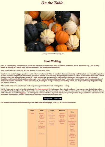
Below are images of the original site (left) and post-redesign (right).
Wow, well done! This looks fantastic. I have looked at a LOT of writers' sites and this is probably the best I've seen–lots of personality and information, but still very straightforward so that people who are in a hurry can find what they're looking for without a lot of fuss. I hope I can hire you to build one for me someday :).
Thanks Kim! I'd love to work on a site for you sometime, just say the word…