I’ve been meaning to post this for weeks — a new poster for an upcoming Lost Cartographers gig on June 4 at Schlafly Bottleworks in St. Louis.

Chicago-based web professional, designer, and musician
I’ve been meaning to post this for weeks — a new poster for an upcoming Lost Cartographers gig on June 4 at Schlafly Bottleworks in St. Louis.
Spring training has begun, and I am looking forward to another baseball season. Though I had played instructional league baseball with some interest as a small child, my real baseball life began when I was nine years old. In 1986, I attended my first game at Shea Stadium (Gary Carter hit a 2-run homer in the bottom of the 8th to beat the Padres), and was thus forever blessed with a passion for the game, simultaneously forever cursed with the albatross of Mets fandom. I spent the next six years or so with baseball as my primary obsession, until the Mets’ disastrous decline (I’m looking at you, Bobby Bonilla) as well as my discovery of music (and girls) caused me to take my eye off the ball for a few years.
With the exception of the odd blog like Uni Watch, design doesn’t get much attention in the sports world (and vice versa), but when I think back to my childhood, it’s clear to me that my first recognition of the power of design is directly related to my love of baseball. A poster with the logos of every major league team hung over my bed, and I would copy them over and over onto a sketch pad, until I could reproduce them from memory. Like some sort of ancient runes, those mysterious combinations of letters, animals, and assorted baseball paraphenalia entranced me for hours at a time (this, by the way, was what I considered the best logo of all time back then. Is it letters? Is it a glove? By Rollie Fingers’ mustache, it’s both!).
Then, of course, there were the baseball cards. I’ll leave the existential metaphysics of those gum-scented rectangles to the excellent Cardboard Gods, but the aesthetics of the things were among the many reasons why I still have a trunk of the things gathering dust in my parents’ attic like the Ark of the Covenant in the Well of Souls. I remember very clearly the excitement of opening my first pack of the new season’s offerings — what would this year’s crop look like? The elegant faux-wood of 1987 Topps? The warm gradients of 1989 Donruss? The glossy slickness of 1991 Upper Deck?
So you can imagine my excitement when a goofy project I proposed at work that involved designing baseball cards got a tentative go-ahead… and my disappointment when the project ultimately got nixed. If anyone would like some custom baseball cards designed for something (family reunions? graduating classes? actual baseball teams?), you know where to find me.
One of my favorite websites of late is Clients From Hell, a compendium of anonymously-submitted horror stories from designers. Paging through the site, however, it becomes clear that many of the issues that arise between designers and clients could be preempted by some simple client education at the start of the design process. Many clients have only a vague idea of what it is that designers actually do, and it is the designer’s responsibility to explain what we do and how. So I’ve compiled a list of a few articles that it may be helpful to have a client read before any project begins; I plan to share these with prospective clients as early as possible to ensure that we are both on the same page as to what our respective roles in the project should be.
Of course, if you have any other suggestions of good articles, I’d love to hear them.
After last month’s one-day course taught by Edward Tufte, I was inspired to try creating my own complex infographic. I decided to tackle a subject that comes up rather frequently in discussions with one particular family member: the relationship between gun control laws and violent crime.
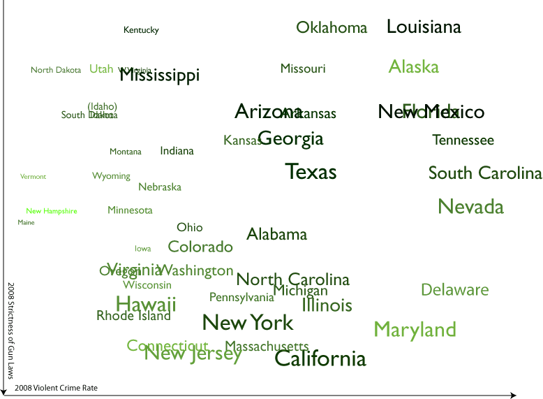
The graphic above charts 4 variables: the violent crime rate in a given state in 2008 (x axis), the strictness of a state’s gun control laws as ranked by gun control advocacy group the Brady Campaign (y axis), a state’s poverty rate in 2008 (on a spectrum from green [low] to black [high]) and a state’s “diversity index” (the likelihood that two randomly selected people will be of a different ethnic group, as determined by the 2000 census; the larger the type, the more diverse the state). I had also thought about indicating both geographical proximity (by means of connecting lines, but these made the graphic nearly illegible) and population density (though I could think of no concise means of indicating that New Jersey’s population density is 1000 times that of Alaska).
Now, I am no statistician or criminologist and I’ll leave the conclusions to them, but it seems to me that this graphic does pretty well at one of the jobs of a complex infographic by, well, complicating the problem. The chart shows pretty clearly that strict gun control laws do not necessarily lead to a lower rate of violent crimes, but it also shows that fewer restrictions on gun ownership also do not lead to a lower violent crime rate — an armed society is not, as some gun rights advocates would argue, necessarily a polite society (as to the wisdom of basing social policy on the musings of a science fiction writer, well, that’s probably a subject for another infographic). Nor do the other variables represented indicate a singular cause of violent crime: some of the most diverse states are among the least violent, as are some of the least wealthy states. What the graph makes clear, I think, is that there is no simple answer to reducing violent crime.
So what do you think? How could this graphic be improved? How could I add more variables while keeping the image legible? I’d love to see some of my designer friends take a hack at this same problem and come up with a different way of looking at the data (which is available here, by the way).
Earlier this week I had the chance to attend a one-day course taught by Edward Tufte, author of one of the classic texts of information design, The Visual Display of Quantitative Information
(he has also written Envisioning Information, Visual Explanations
, and Beautiful Evidence
). Have attained rock-star status among certain circles of geeks (he spends a total of about an hour at these courses signing autographs), the Yale statistics Professor Emeritus spoke for about five hours on the topic of “Presenting Data and Information.” In large part, the course was a distillation of the arguments he has made in his books, with a practical focus on presenting and consuming in-person presentations of information. Some of the points he made that stuck with me:
Of course, all designers would agree with some of these points (that design should be content-driven, for example) but that last point seems to fly in the face of conventional design thinking. I would love to hear a debate between Tufte and John Maeda (whose book Laws of Simplicity I reviewed a while back).
One of the fun parts about being a designer in a band (and probably the reason that so many designers are also musicians) is getting the chance to design all the schwag that goes along with the music: album covers, websites, t-shirts, and of course, gig posters. Designers love doing music-related projects, as other creatives tend to give designers more creative freedom than the average client. Often, particularly with gig posters, we’re freed from the usual constraints of having to clearly communicate a set of information (I’m fairly confident that no one in this day and age actually finds out about a gig by way of a poster) in favor of producing a work with an emotional impact, one that tells the story of a band’s sound in a single image (check out this great collection for some examples, and this post and its comments for some criticism of this paradigm).
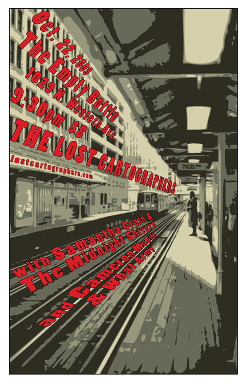
Next week, the Lost Cartographers and I will be playing at Chicago’s legendary Empty Bottle for the second time; we’ll be opening for the incredible Samanatha Crain & The Midnight Shivers (check out this preview of the show). The Bottle’s promo folks asked us to provide some posters, and while we don’t normally make posters (the return on investment is just too low in terms of getting people to come to the show), I decided it might be fun to do one for what promises to be such a great show.
I’d be interested to hear in the comments what you think about the poster — does it capture our sound, and tell the story of our music (which you can hear here if you haven’t already)?
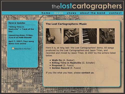
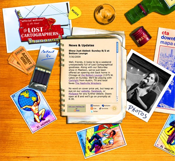
I just realized that the last few months have been so busy that I completely forgot to post about a project I completed at the beginning of the summer. In preparation for the release of the Lost Cartographers’ debut album, I decided to to redesign our website. While the old one was still workable, I wanted to design something that a) was consistent with our cd packaging and b) did a better job of integrating our social media presence. I also had an itch to create something in a photorealistic style, as opposed to the relatively clean graphic style I often gravitate toward.
Here is the before:
And the after:
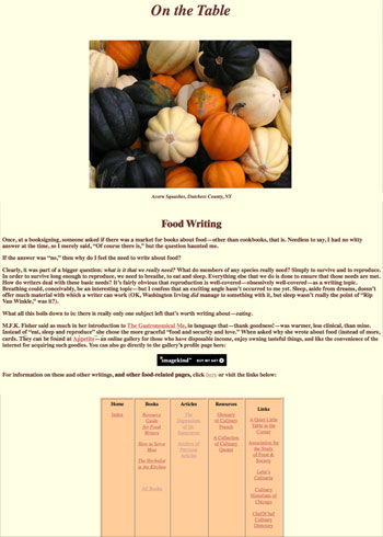
My stepfather, Gary Allen, is a professional food writer/editor/eater (ok, he doesn’t technically get paid to eat, but he takes it at least as seriously as any paying gig). Last year, as a birthday gift, I offered to redesign his website. His original site (which he had built himself using Dreamweaver) had served him well enough over the years, but I felt that I could improve upon it and help him generate more leads, more jobs — and, of course, a bigger inheritance for myself.
I had three goals for the redesign of the site:
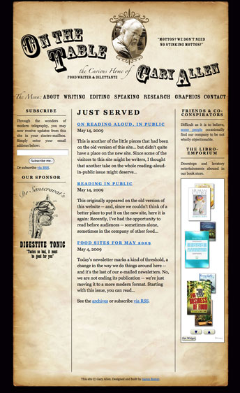
1) Give the site a more professional look without losing the personality and sense of humor of the original. While Gary had been a professional illustrator and print designer earlier in his career, he didn’t quite know how to make those skills translate onto the web. I felt that, if the web site was going to be his professional face, it needed a cosmetic overhaul. But I wanted to be sure that the look retained the quirkiness (and faint whiff of curmudgeon) that seemed to be part of what set him apart from his peers. As it turned out, this was actually the easiest part of the project. One of the advantages of having a close family member as a client is that you don’t necessarily need to spend a lot of time getting to know them, their likes and dislikes, and so on. I initially pitched a “tongue-in-cheek antiquarian” approach, and Gary, while suggesting a few tweaks (the curve on his name, which really helped smooth out the header, was his idea), loved my first draft.
2) Refine the site’s information architecture to highlight Gary’s wide variety of skills. The original site contained a lot of information. Because it had grown up rather organically, it was not always clear how certain pages were related to others, and there was no consistent navigation. Since the the site’s primary purpose was to land Gary more jobs, I decided to focus the information architecture around the different skills he can brings to, ahem, the table. This way, the visitor is quickly made aware of what Gary can do for them and their food-related projects.
3) Make it as easy as possible for visitors to sign up for his newsletter. For years, Gary has sent out a weekly email featuring culinary quotes, links to food-related sites and other such miscellanea. With nearly 600 subscribers, this newsletter has been Gary’s primary promotional tool for many years; however, it was nearly impossible to find out how to sign up for it on his old site. So I wanted to make sure that there was a sign-up for the mailing list on every page. I also wanted to ensure that visitors could use subscribe an RSS feed of his updates, so I convinced him to turn the mailing list into a blog (“Just Served”) that is integrated seamlessly into the site. This gives him the advantage of consistently adding new content to the site (a plus for search engine optimization) as well as the ability to archive his weekly updates on the site.
Below are images of the original site (left) and post-redesign (right).
Anyone care to lend a poor blocked designer a hand? Last week it was brought to my attention that one of the Law School’s digital signs is a plasma screen (which, unlike the LCDs that display the signage throughout the rest of the building, carries a risk of burn-in from static images like the background image below (designed by Four Winds Interactive, the company that created the content management software we’re using for the signs).
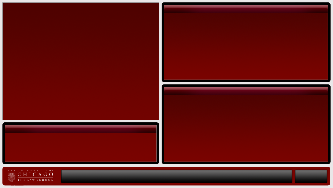
Right now, the top left hand box features live TV, while the other boxes feature text that rotates periodically. The bottom bar contains a left-ward scrolling list of recent additions to our blogs, podcasts, etc. I need to figure out a way to keep the same color from being in the same place for longer than an hour. I’ve tried moving the various boxes around, but they’re all the same basic color. Changing the colors periodically might work, but will be ugly and inconsistent with our brand. Perhaps periodic “commercial” interruptions, where we expand some of our rotating content? Any suggestions would be much appreciated!
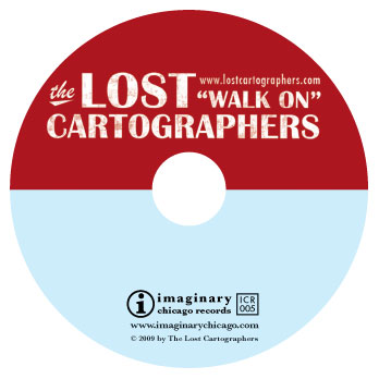
It’s been nearly as long in coming as “Chinese Democracy,” but The Lost Cartographers‘ debut album is about to be sent off to the manufacturers. The album features cover and disc design by yours truly, working off of a photo of a South Side food & liquor joint that I found on Flickr (the photographer generously offered use of the photo for the price of a complimentary CD.
The goal here was to come up with a design that was timeless, reflected the sound of the band, and — as our bassist Karl put it — would look awesome on a t-shirt.
