New Website! Or, I Am My Worst Client

Today I officially announce the launch of my new-and-improved, new-look-same-great-taste, satisfaction-guaranteed-or-your-money-back personal website. There are a few more things to do (updating my email signature and Twitter avatar, perhaps business cards) to make the rest of my online presence consistent with the new site, but I feel comfortable enough with it to release it into the wild (comments and feedback are, as always, welcome and appreciated).

Before

The old site, which launched in late 2007, was showing its age, and badly, with some of the web 2.0 cliches of its era (I’m looking at you, orange.) The new one cleans up the information architecture and rolls out a new look that I think fits better with my “personal brand” (or, as they used to call it, my “personality”). In some ways, the new look harkens back to my very first freelance website from 10 years ago… but no Papyrus on this one, thank you very much.

I had actually been working on this relaunch for quite some time. It’s a common lament among designers that creating one’s own identity pieces is surprisingly hard; after all, how do you visually communicate your ability to create visual communications? And while they say you are your own worst critic, I’ve decided that I am also my own worst client. Consider the following list of sins that every designer dreads encountering in a client:

  • I changed my mind on designs that I had already signed off on, for reasons that were largely arbitrary.
  • I ignored deadlines that I had set for myself.
  • I flaked out and abandoned the project for months at a time.

I’m sure that if I had been charging myself, I probably would have been late with payment, as well. But this self-branding exercise is helpful for all designers to go through. The skill at the core of good design, I believe, is empathy — the ability to put oneself in the shoes of, say, a website’s users or a customer’s clients. I think we’ve all had clients where we just don’t understand why it’s so damn hard for them to make a decision, or to provide content they promised by the date they themselves suggested, or whatever. Being our own client, however, reminds us that these things are not always as easy as we might think.

What Do Mobile Users Want?

(cross-posted at the University of Chicago Law School Electronic Projects Blog)

Optimizing the Law School’s website for mobile devices is one of those things that has been on my to-do list since just about the day I started here. But it is, alas, one of those long-term projects that continually gets pushed to the bottom of the list due to more immediate, deadline-driven concerns. The new website we launched last summer — built, as it is, in a generally web-standards-compliant fashion — is somewhat more mobile-friendly then the previous version, but we did not have the budget or time to build in a mobile-specific site to that project.

This summer, however, I am determined to make some headway in this area, particularly after catching Justin Gatewood’s very helpful presentation on using CSS for this purpose at the 2010 eduWeb conference. Before I dive into the CSS, however, I need to figure out what it is that UChicagoLaw’s mobile are (or would like to be) using our site for.

Enter Google Analytics. We’ve had Analytics installed on the Law School’s website for a while now, and I browse our stats periodically, especially looking for broken links) but digging deeper into all of the tools that Analytics has to offer has been yet another one of those projects that winds up tabled in favor of dealing with more immediate concerns. However, after a little stumbling blindly around the site, I was able to create an “Advanced Segment” that would separate mobile users out from the rest of the site’s users.

Here is what I was able to discover about our mobile users over the time period roughly corresponding with the 2009-2010 academic year:

  • Visits by mobile device users comprised just over 1% of total visits.
  • Pageviews by mobile devices comprised less than 1% of total pageviews.
  • iPhone, iPad, and iPod users were by far the most frequent viewers of the site, making close to 80% of all visits. Android users were a distant second, at just over 10% of visits.
  • To my surprise, over a third of our mobile pageviews appeared to have been by prospective students (i.e., within the prospective students section of our site), with the page containing the link to allow them to check their application status being accessed even more often than the site’s home page.
  • By contrast, pageviews of pages clearly identifiable as being of interest primarily to students made up just 10% of the total.
  • Internal search resulted in almost exactly 1% of pageviews, with course-related information being the most commonly sought data.
  • Most external searches (i.e. via Google) were for some variation of the school’s name, followed by the status checker and assorted other admissions-related items.
  • There were few visits to our contact/directory page and very few searches (internal or external) for the terms “directory” or “contact”  This was also suprising, as I would expect that users on their mobile devices might frequently be looking for phone numbers or email addresses.

What does all this mean? To my mind, it indicates that prospective students should be the primary audience toward whom the mobile version of our site is aimed. Of course, current students and staff use the site via mobile devices as well, but not nearly as much as I might have expected.The information geared towards those internal audiences should, it appears, be primarily related to courses.

Wrangling the Octopus

Yesterday, I gave a presentation at the eduWeb conference entitled “Wrangling the Octopus: Managing Your Social Media Ecosystem.” In the presentation, I outlined the tools that I use to keep content flowing to the University of Chicago Law School’s many social media outlets.  The Cliffs Notes version:

  • I try to operate under two general principles: automate as much as possible, but don’t lose the human touch.
  • Using Yahoo Pipes, I create a master feed that aggregates all of our syndicated content (blogs, podcasts, news items, etc.).
  • That master feed is fed into Feedburner, in order to maintain a single static URL and to ensure that the feed validates. Feedburner also creates an animated gif of the feed that can be added to HTML emails.
  • The Feedburner feed is fed into dlvr.it, which sends content out to Twitter and Facebook.
  • We use CoTweet to share our primary Twitter account among team members, and Echofon to monitor Twitter in real time.

My Prezi “slides” are embedded below:

@lougan caught a minute or so on video (embedded below), and @omahaNE posted his notes and audio on Livescribe.

Establishing an Institutional Presence on Goodreads

If there’s a mantra for organizations or institutions in social media, it’s this: connect with your users where they are. Or, I would add, where you think they’d like to be. That’s why at UChicagoLaw, we decided to launch an institutional presence on Goodreads, a social network focused around books. Founded in 2006, Goodreads allows users to keep track of books they’ve read or would like to read, post reviews and read the reviews of their friends, form book clubs, interact with authors, and more.

Our goal was twofold: to maintain engagement with alumni, and to promote the work of our faculty to the world at large.

We’re not sure how many of our alumni are already on Goodreads, but we’re pretty sure that a lot of them would like to be if they knew about it. If you’re familiar with the University of Chicago, you probably know that most folks affiliated with it are unabashedly geeky about something, be it 12th century Portugese literature or the intricacies of the anatomy of sea slugs of the genus Dunga, and the Law School is no exception (check out our course offerings on subjects like Admiralty Law and Ancient Roman Law if you don’t believe me). And along with that geekiness naturally comes a love of books. So while Goodreads remains a niche site, we’re fairly certain that it’s a niche site that suits our audience well, and confident that we can begin to get them engaged there.

Since Goodreads does not currently have an equivalent of Facebook’s Pages (or Public Profiles, or whatever they’re calling them this week), building an institutional presence required a little creativity. Here are the steps we took:

  1. Created an account with the username “UChicagoLaw,” uploaded avatar photo, filled out info, etc.
  2. Created “shelves” for the categories of books we wanted to highlight, and added books to those shelves; in this case, “Faculty Books” (all books by current faculty); “Faculty New Releases;” “The Illustrious Past” (books written by deceased and former faculty while at the Law School); “Law School Classics;” and “Faculty Recommendations” (based on responses to our annual questionnaire to faculty about what they’re currently reading).
  3. Added our faculty members as our “favorite authors.”
  4. After adding 50 books to your profile, you can apply to become a “librarian;” this gave us the opportunity edit the author pages for faculty, including adding photos, bios, and blog feeds. You can also add YouTube videos to authors’ pages.

That got us to the point that we felt comfortable launching. Plans for the future include reviving a dormant alumni book club using the site, as well has getting some of our faculty involved in Q&A’s about their recent works.

We’ve built it; now we’ll see if they come.

Twinfomercials

Those of you on Twitter are doubtless all too familiar with the thousands of spam accounts set up to pitch porn, Viagra, and  get-rich-quick schemes. Recently, I came across a more insidious form of Twitterspam created to sell, of all things, an alt.country band.

I had stumbled across the @AltCountryMusic feed via a TweetDeck search for “alt.country” (as many of you know, I’m in an alt.country band myself, which also has a Twitter presence). At first glance, I thought this might be a useful feed to follow to keep up with what’s going on in one of my favorite genres. There were lots of links along the lines of “awesome alt country music group live” (with a link to a YouTube video), “Great alt Country music band on facebook” with a link to the band’s page, and so on. After clicking on a link or two, however, I realized that all of these links were to material by the same band. To top it off, the band has at least one more generic front feed (@CountryMusicNow), in addition to a feed for the band itself. Unsurprisingly, I lost all interest in the band upon learning I’d been tricked into listening to their material.

These sorts of feeds are not unlike infomercials: blatantly sales-oriented, under a thin veneer of being helpful or entertaining. They are, in many ways, an abuse of trust — no one really believes that Mr. T thinks the Flavorwave Oven is really that great, and the fact that we know he’s lying to us creates an instant distrust of the product. The road to success in social media is, I think, exactly the opposite of that of the infomercial: earn peoples’ trust by proving yourself helpful or entertaining, and people just might be interested enough in what you have to sell to consider buying it. Trying to force it the other way will only turn people off.

In Which I Land on Boagworld

This past week’s episode of Boagworld featured yours truly doing an audio version of my review of Prezi.com (originally featured here). Boagworld is the only web design podcast I listen to religiously and I’ve highly recommended it before; aside from being quite informative, the hosts, Paul and Marcus, are very entertaining and exceedingly funny… maybe it’s the British accents? It’s a pleasure to be associated with such a great resource for the web design community.

Product Review: Prezi

A while back someone on Twitter alerted me to a new web app called Prezi, which bills itself as a tool to “create astonishing presentations live and on the web.” I finally had a chance to use it for my recent presentation to the Law School’s entering students on managing online identity, and I could not be more impressed with the product.

Like PowerPoint, Prezi is intended to help you communicate the key points of your presentation through visual reinforcement. Unlike PowerPoint, Prezi has jettisoned the boring, linear, bullet-point structure we’ve come to expect from such programs and replaced it with a user experience in which the viewer feels as though they’re flying above and zooming into a giant map of your presentation. You can even change the structure of the presentation on the fly in order to react to your audience’s questions. It really has to be seen to be believed.

Prezi’s user interface for creating presentations is equally as innovative. Instead of a standard toolbar, the tool menu items are presented as bubbles attached to a larger bubble that rotates when clicked upon. When you place an object onto your map, a set of concentric circles is overlaid, and each circle does something different: one allows you to drag the object through 2D space, one allows you to resize, and one allows you to rotate.

I do have a few quibbles with the product, of course. While you can change the basic look of your presentation, you can’t choose custom colors or fonts, or change the shape of your frames. A great deal of precision is needed to select multiple objects in editing mode which sometimes means performing the same action three or four times before you get it right. Also, while you can embed many different types of media, from still images to video, there is no way to embed links to a live website, which make for a much more dynamic presentation than simple screen shots of a website.

Prezi should prove useful to designers in several ways. Of course, if you give presentations or make client pitches, the benefits of Prezi’s ease of production and its added “wow factor” will hook you right away. But the unique interface should also prove inspirational to designers as it illustrates the power of rethinking design elements that we tend to take for granted. Finally, it should be useful to information architects as a mind-mapping application. I’ve tried several such applications over the years and Prezi beats them all for ease of use in actually getting your ideas down on the screen and illustrating the relationship between them.

Like most web apps, there’s a three-tiered pricing scheme; the free version includes the Prezi logo on all of your presentations, while the next level removes that and provides more storage, and the most expensive level allows you to edit your presentations offline (all versions include the ability to play presentations offline). The free version is more than worth a trial run.

Presentation: Twitter in Higher Ed Communications

Next week I’ll be presenting at the 2009 eduWeb conference here in Chicago. My talk will be entitled “A Bird in the Hand: Twitter as a Higher Ed Communications Tool” and will present some of the reasons why institutions of higher education might want to use Twitter and provide some tips and techniques for getting such a project off the ground. The powerpoint of my presentation is now up on Slideshare.

Project Update: The Law School Redesign

Last week, the University of Chicago Law School (where I am the Manager of Electronic Communications) launched its redesigned website. I have been working on this project in one form or another since I was hired in late 2007, and, like most projects of such size, the launch is by no means the end of the work needed. As a result, it has been hard to wrap my head around the fact that this stage of the project is complete. However, I thought this was a good time to ste back and reflect a little on the process.

In many ways, this project has been very unlike the other projects I’ve detailed on this block. This is by the far the biggest project that I have worked on, both in terms of amount of content and the number of people involved. While most of my previous projects have involved, at most, the client plus one other designer, this one involved a team of two designers (from the small Chicago design firm Rogue Element) and a development team of half a dozen members of the Chicago web development firm Palantir.net, not to mention the many stakeholders at the Law School itself.

Also unlike other projects I’ve worked on, in which I’ve often done design and development, my role here was generally limited to information architecture and project management. Aside from gaining some valuable experience in keeping so many moving parts going in the right direction, this also meant that I had the chance to observe the processes by which Rogue Element and Palantir worked. Getting to observe some more-experienced colleagues as they worked was a great learning experience.

The biggest difference between this project and the others I’ve worked on, however, was that I was, for the first time, playing the role of the client while working with other designers and web professionals. This is something that I think most web designers don’t get the chance to do often, and I found that it provided me with some valuable insight into the assumptions at play on both sides of the working relationship. I hope that I can use this insight to make my own interactions with clients even more productive.

Project Update: On the Table

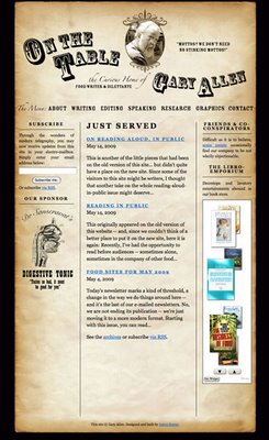
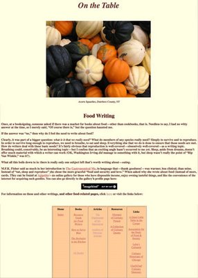
My stepfather, Gary Allen, is a professional food writer/editor/eater (ok, he doesn’t technically get paid to eat, but he takes it at least as seriously as any paying gig). Last year, as a birthday gift, I offered to redesign his website. His original site (which he had built himself using Dreamweaver) had served him well enough over the years, but I felt that I could improve upon it and help him generate more leads, more jobs — and, of course, a bigger inheritance for myself.

I had three goals for the redesign of the site:

1) Give the site a more professional look without losing the personality and sense of humor of the original. While Gary had been a professional illustrator and print designer earlier in his career, he didn’t quite know how to make those skills translate onto the web. I felt that, if the web site was going to be his professional face, it needed a cosmetic overhaul. But I wanted to be sure that the look retained the quirkiness (and faint whiff of curmudgeon) that seemed to be part of what set him apart from his peers. As it turned out, this was actually the easiest part of the project. One of the advantages of having a close family member as a client is that you don’t necessarily need to spend a lot of time getting to know them, their likes and dislikes, and so on. I initially pitched a “tongue-in-cheek antiquarian” approach, and Gary, while suggesting a few tweaks (the curve on his name, which really helped smooth out the header, was his idea), loved my first draft.

2) Refine the site’s information architecture to highlight Gary’s wide variety of skills. The original site contained a lot of information. Because it had grown up rather organically, it was not always clear how certain pages were related to others, and there was no consistent navigation. Since the the site’s primary purpose was to land Gary more jobs, I decided to focus the information architecture around the different skills he can brings to, ahem, the table. This way, the visitor is quickly made aware of what Gary can do for them and their food-related projects.

3) Make it as easy as possible for visitors to sign up for his newsletter. For years, Gary has sent out a weekly email featuring culinary quotes, links to food-related sites and other such miscellanea. With nearly 600 subscribers, this newsletter has been Gary’s primary promotional tool for many years; however, it was nearly impossible to find out how to sign up for it on his old site. So I wanted to make sure that there was a sign-up for the mailing list on every page. I also wanted to ensure that visitors could use subscribe an RSS feed of his updates, so I convinced him to turn the mailing list into a blog (“Just Served”) that is integrated seamlessly into the site. This gives him the advantage of consistently adding new content to the site (a plus for search engine optimization) as well as the ability to archive his weekly updates on the site.

Below are images of the original site (left) and post-redesign (right).