Project Update: The Law School Twitter Feed

The Law School now has its very own Twitter account, which can alert you to newly added content from everything from our Faculty Podcast to our alumni magazine.

If you’re the curious type and are wondering how I accomplished this feat, read on.

When we in the Communications department here at the Law School first started trying to figure out how we might be able to use Twitter, our first inclination was to aggregate the Twitter feeds of our brave student and faculty Tweeters into a single stream and feed it back into Twitter. We eventually settled on the TweetChicago format for two reasons. Most importantly, we felt that format did a better job at putting faces to stories, but also… it is much harder than it sounds to effectively aggregate Twitter feeds.

I recently decided to tackle the problem again in order to address a long-standing problem with our Facebook Page. One of our goals for the Facebook page was to allow our “fans”quick access to our various blogs and podcasts, and while RSS aggregating apps exist for Facebook, most of them don’t really seem to work — I was having to manually refresh. The best way to get an RSS feed into Facebook remains their “Notes” application, but you can only import one feed at a time into Notes. So what’s a poor Manager of Electronic Communications to do?

Now, I’m no programmer, so I knew I was going to have to turn to a third-party tool. Initially, I tried FeedInformer (formerly FeedDigest), a service I’ve had some success with in the past. However, just pulling a bunch of feeds together and outputting a list wasn’t going to make much sense to our end users; how were they supposed to know whether the post they were about to click on came from our Faculty Blog, our Admissions blog, our Student Events podcast, or what? We needed a way to add a prefix to the title of every post that explained which feed it was coming from.

I was going to have to use (gulp) Yahoo Pipes.

I had tangled with Pipes once before, when attempting to create a simple aggregated feed of Tweets from members of the UWebD community. While making that pipe any more complex than a simple aggregation was beyond my skills due to the vast amount of potential data involved, I figured that with a small set of feeds I could jerry-rig something that might work.

I began by creating a pipe for each of the feeds I wanted to include (including all the aforementioned blogs and podcasts as well as a del.icio.us feed of Law School-related news stories. As you can see in the screen shot below, these pipes just 1) grab the feed, 2) replace the beginning of the post’s title with a prefix reflecting the feed it comes from, 3) sort the feed by pubDate and 4) outputs the feed.

Picture-1

The next step was to aggregate all of those pipes into one. This “master pipe” 1) grabs each of the earlier pipes 2) removes the author tags (for some reason, they were creating problems in the output) 3) sorts by pubDate again 4) truncates the feed to 10 items for the sake of simplicity and 5) outputs the feed, which I can import to our Facebook Notes or (ta-da!) route to the UChicagoLaw Twitter account via Twitterfeed.

Picture-2

This system is still not perfect — Twitterfeed seems to have a tendency to choke on the feeds created by Pipes, and sometimes posts tweets up to 24 hours after the original post (which sort of negates the immediacy that makes Twitter so appealing).
TweetChicago: Behind the Scenes

Last month the Law School announced its TweetChicago page, which collects together an ever-increasing number of our faculty and students’ 140-character-or-less musings on the micro-blogging service known as Twitter. Since then we’ve had several inquiries as to how we put this little experiment together, so here’s a real brief explanation.
TweetChicago is basically just built off of the standard HTML/javascript widget that Twitter makes (not-so-easily) available:

<div id=”twitter_div”>
<ul id=”twitter_update_list”></ul>
</div>
<script type=”text/javascript” src=”http://twitter.com/javascripts/blogger.js”></script>
<script type=”text/javascript” src=”http://twitter.com/statuses/user_timeline/username.json?callback=twitterCallback2&amp;count=5“></script>

Just change “username” above to the name of the user whose tweets you’d like to widgetize, change the “count=” to the number of tweets you’d like to display, and paste into your webpage.
Just like that, you have your first tweeter’s widget.

The tricky part comes in when you want to include multiple widgets on one page. Because of the way Twitter’s javascript is written, it will only call one tweeter’s feed on each page. You can get around this by creating a separate page for each tweeter (e.g., “tweeter1.html,” “tweeter2.html,” etc. You can then embed these pages in your aggregator page using iframes:

<iframe id=”tweeter1 src=”tweeter1.html>

Note that the tweeter’s individual pages will need to include a link to the .css file you’re using to style them, as the styles from the main page where you’re embedding the iframes will not apply to the pages contained within iframes.

This is not a terribly elegant — nor, unfortunately accessible — solution, but it’s the only way I could figure out to get around the one badge per page bug.

Concert Review: The Decemberists


No band I’ve ever seen has more fun on stage than the Decemberists. I’ve seen them four or five times over the last couple of years, and it’s always obvious that they are having an absolute ball. I had the chance to see them twice over this weekend, at Wheaton College on Halloween and then the next night at University of Chicago.

The Halloween show was a classic. It opened with a reenactment of “The Shining,” with singer Colin Meloy pedaling a Big Wheel onto the stage to be met by the creepy twins of drummer John Moen and bassist Nate Query (whom Meloy noted were likely the first two cross-dressers ever to appear on stage at famously conservative Wheaton College’s Edman Memorial Chapel).


With a setlist tailored to the evening, the highlight of the night was a version of “Shankill Butchers” featuring Jenny Conlee playing the chapel’s massive pipe organ. If you listen to the recording, you’ll hear the band launch next into “Culling of the Fold,” but I wasn’t able to record the whole thing, since during his frenzied stalking of the stage, Meloy reached out and grabbed my iPhone as I was trying to take a picture of him (my wife made me promise I’ll never wash it again).


The following night’s show was a bit less inspired — maybe it was the crowd of “Where Fun Comes to Die” students, or maybe it was just that we had to sit for part of the show instead of being right up at the front of the stage — but it was still great. The highlight of the U of C show was when Meloy grabbed a fan’s video camera and created an on-the-fly Public Service Announcement (the PSA starts about 5 minutes in). And they finished with a rousing — and inspiring — version of “Sons and Daughters” that had everyone in the crowd singing along.

An Event Apart Chicago, Day 2: The Two-Weeks-Later Wrap-up

Wow. It’s already been two weeks since AEA Chicago, and I’m just now finding some time to sit down and sum up what I took away from it (yeah, it’s been that kind of two weeks). Anyway, without further ado:

Rob Weychart
, “Design Lessons in Chess” – Having recently discovered a passion for reading about chess, Weychart found some similarities between the ancient game and the design process, which he summed up with the following points:

  • Content is king.
  • Know your history.
  • Think ahead.
  • Don’t get too attached.
  • Act with purpose.
  • Obey circumstance.
  • Principles are your friends. Except when they’re not.
  • The journey is as important as the goal.

Dan Cederholm, “Implementing Design: Bulletproof A-Z” – Cederholm ran through some hands-on tips based on the principles of “bulletproof design” and “progressive enhancement” (rather than “graceful degradation”). Biggest takeaway: websites don’t HAVE to look the same in all browsers.

Cameron Moll, “The In-House Designer” – Co-author of one of my favorite web design books, Moll has an interesting job description: in-house designer for the Church of Latter Day Saints. He quoted the New York Times’ Koi Vinh as having stated that in-house designers spend only 20% of their time on their actual work, 40% on publicizing their work, and 40% building relationships. To build relationships within LDS, Moll instituted weekly and annual design reviews so that everyone in the organization could see what everyone else was working on — this is something I think U of C could really benefit from.

Curt Cloninger, “What Would William Do?” – Cloninger took a look at how William Morris might approach the current sterility and stagnation of design on the web; among other things, he argued for typography being the natural material of the web and that beauty is not mere ornametation but added value.

Finally, Jeff Veen argued in “Designing the Next Generation of Web Apps” that rather than telling people stories, web apps should be giving people the tools to tell their own stories, moving from narration to discovery, from visual cues to interactivity, and from editing to filtering.

So, to sum it all up: An Event Apart was definitely worth attending. The speakers were, by and large, fascinating and inspirational. Being the veteran of not a few academic conferences, I am pleased to say that not once was I bored at this one — perhaps the highest praise of all.

An Event Apart Chicago, Day 1: The Ten-Minute Wrap-up

Just got back from Day One of An Event Apart Chicago. I’ve got a bunch of client and personal work to do tonight, so before I settle in with a cold one and Dreamweaver, I’ll try to sum up quickly what I took away from some of the sessions I attended.

Jeffrey Zeldman, “What is Web Design?” – Zeldman’s talk was something of a “state of the profession” address, but for me the biggest resonance came in the first few minutes, when he asked what skill web designers need most. His answer (and mine): empathy. To be able to put yourself in the user’s shoes, and understand the user’s experience is key to everything else we do. What struck me about this answer is that it is also what scholars of religion (as I used to aspire to be) ask of their students in attempting to learn unfamiliar cosmological, theological, and eschatological views; it struck me that this was something I had left out of my post describing the similarities between my old career and my new one.

Jason Santa Maria, “Storytelling by Design”– Santa Maria’s basic argument was that if web designers are narrators of stories told by websites, we should be using more adventurous visual layouts to augment those stories, in the way that magazines do, and not succumb to sameness.

Sarah Nelson (of Adaptive Path), “Design Criteria” – Nelson described hwo she manages the creative process, and argued that generating with the client a set of 5-7 short, memorable, strategic directives in writin can help your team focus its creative efforts.

Jason Fried (of 37signals), “User Interface Design Beyond the Basics” – The money quote for this one: “Copywriting is interface design.”

Andy Clarke, “Underpants Over My Trousers” – The highlight of the day for me. An avid comic book fan, Clarke discussed how he found inspiration for designing a Puerto Rican newspaper site by studying the ways that comics use the convention of differently sized, shaped, and arrange panels to build drama.

Esta un Perdedor: Beck at the Aragon (10/2)

(Last Friday I published a review of the 10/2 Beck show on the Lost Cartographers’ blog — figured I’d cross-post it here.)

For your average rock show, last night’s sold-out Beck show at the Aragon Ballroom was pretty damn good. There was an energetic crowd, a mix of old hits and new material, and very loud guitars. The thing is, Beck is not your average rock star. As one of the most consistently innovative artists of the last 15 years (Jesus, I feel old writing that), when you go to see Beck, you expect the unexpected: maybe some puppets, or entire songs played on dinnerware, or at least a little break-dancing. But aside from a three-song acoustic break and a slightly embarrassing borderline minstrel-show hip-hop bit in which all five band members grabbed head sets and drum machines and did everything but tell the lily-white crowd to throw their guns in the air and wave ’em like they just don’t care, last night’s show was essentially a straight-ahead stadium rock extravaganza. The only accoutrements in evidence were a giant projection screen in the background (featuring what appeared to be someone’s senior thesis in abstract expressionist film) and some nifty lights not unlike those Tom Petty brought to the United Center a couple months ago. Hell, Beck is even starting to look a little like Tom Petty. Don’t get me wrong: I love Tom Petty, and it was fun hearing rocked-out versions of old favorites like “Loser” and “Where It’s At,” but I expected more interesting stage antics — or at least a little amusing banter — from someone I’m not embarassed to refer to as a visionary. Of course, this hard-rock minimalism may just be the latest in Beck’s endless stream of transformations — but it’s certainly the least interesting one yet.

Project Update: Forward Alliance

I recently wrapped up a site design for Forward Alliance, a life coaching and psychotherapy practice run by Ioanna Chaney. It was an interesting process, as it allowed my Design:Intelligent colleague Katie Petrak and me to experience building a small business brand from the ground up.

When Ioanna came to us, she had an existing website that was generally serving her needs; however, she felt that it could use some reorganization and a visual overhaul. She also wanted a postcard-sized mailer that could be used to market her services to other professionals in her building, etc.

the original Forward Alliance website

In our initial discussions, we touched upon the need for a visual identity that would link the website, the mailer, and her business card and decided that the first step was the creation of a Forward Alliance logo (something she had not previously considered). Building on Ioanna’s core mission of promoting personal growth, Katie and I collaboratively came up with the mark below.

From there, we moved on to creating the business card and mailer, with Katie doing the majority of the work on these. Ioanna chose to focus these pieces on the message of growth conveyed by the grass portion of the mark, rather than the entire mark, since she felt that they were intended more to market her personal services rather than the business as a whole.

business card
postcard, front

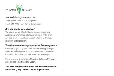
postcard, back

Finally, I set to work on the website. The goals of this portion of the project were to create a standards-compliant (and therefore more search-engine friendly) site, with a cleaner, more polished look that was still friendly, warm, and welcoming. Since frequently updated content is also more attractive to search engines, we also decided to convert the “Tips” section of the previous site — in which Ioanna had posted some of her favorite quotes and sayings — into a blog-like section of the site called “New Growth.” The tips section has always been a favorite of her clients, and now they have the capability to have new tips delivered directly to the their inboxes or feed readers. If you have a chance, take a look at the site and let me know what you think!

Forward Alliance website, by Aaron Rester